Having a difficult time coordinating your brand colour? If you have ever dealt with signage, then you know that one of the most difficult tasks that clients come across is communicating the correct colour to the designer and getting the final product right.
This is difficult because most clients are unfamiliar with the technical side of printing and signage, which is why we are frequently requested for a document or article that could help the clients understand and coordinate their brand colour.
This document aims to do just that by discussing the various printing methods and how to use the Pantone Matching System to coordinate your signage colours, so you get the exact result that you asked for
The various factors that affect the colour
Print Method
The printing method is one factor that will influence your colour output. There are two printing methods used:
- Spot Colour Printing
- CMYK (Cyan, Magenta, Yellow, Black) or Full Colour Printing
CMYK (Full Colour Printing)
The process of creating an image or a variety of colours using Cyan, Magenta, Yellow and Black.
This process is used by all Digital Printing machines via the printing head which has a combination of 4 nozzles (CMYK).
You may remember the days of running into the photo shops like Camera House or Kodak and paying to get your camera films developed and printed into photos. This was produced by CMYK printing. Think about it, you couldn’t possibly have someone stand there and mix all the colours in the photo to print it, it’s impossible. Hence CMYK printing is great and the only option for images and pictures.
The CMYK printing method can be utilised by conventional printing machines such as offset and screen printing, however, the 4 colours are printed separately. The screens or plates are made for each colour utilising a screen or tone of dots representing the weight of that colour tone in the image. Once all these colours are overlaid it produces a full-colour image perfectly.
Let’s take the CMYK values for a shade of green below.
- 100% cyan, 2% magenta, 100% yellow and 2% black
This reference is given to the printer who updates the green in the artwork on their end and prints the file and hey PRESTO! It’s ink to substrate.
However…..
Top 3 factors why CMYK printing output varies from printer to print shop?
- Different Digital Printing Machines
- The temperature of the print room
- Print Substrate (material/paper/self-adhesive vinyl) being used
These 3 factors significantly impact the colour output onto print substrates even though the same CMYK values were used to print that green across all machines and locations.
While great for full-colour images, CMYK printing is not the best for spot colour accuracy.
Spot Colour Printing:
This print method uses single pigmented inks to print precise colours. Simply like your experience with paint you buy from the hardware stores.
How does Spot colour printing help with colour accuracy?
- Accurate vibrant colours. An example of this is Pantone orange. If you try to print orange using the CMYK method it will appear slightly brown. Using the spot printing method the orange will be bright and pure.
- Instead of issuing CMYK values for the printing machine, you are providing an international standard colour which, once printed, is checked against the Pantone Matching System (PMS) book reference. Ink is then altered and further samples are printed until the colour matches the PMS Book reference. This means that regardless of the substrate, temperature or printing machine the ink is adjusted to compensate and get the correct shade.
So what exactly is the Pantone Matching System??
The Pantone matching system is a standard matching system developed by the “Pantone” company and is used to identify and match colours. The colours are identified using numbers which is ideal for communicating the exact tint.
What are Pantone Formula Books?
PMS books are colour education books or formula guides that contain shades of different colours, these books are used as a reference or a standard for matching and comparing colours.
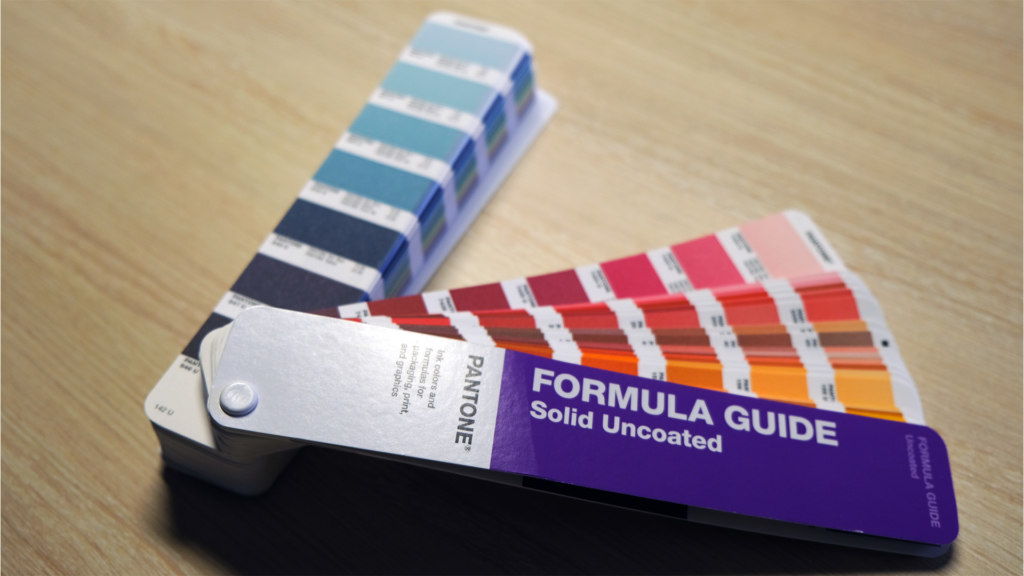
There are two main types of Pantone books, coated and uncoated. Other types are available for neon and pastel type finishes. The coated and uncoated books are most common for printing. Coated colours are glossy as it is based on coated inks whereas uncoated colours have a matte or satin look as they are based on uncoated inks.
How to correctly communicate your colour to the designer?
When trying to communicate with the designer you can use the colour PMS number to communicate the PMS spot colour reference to your contractor.
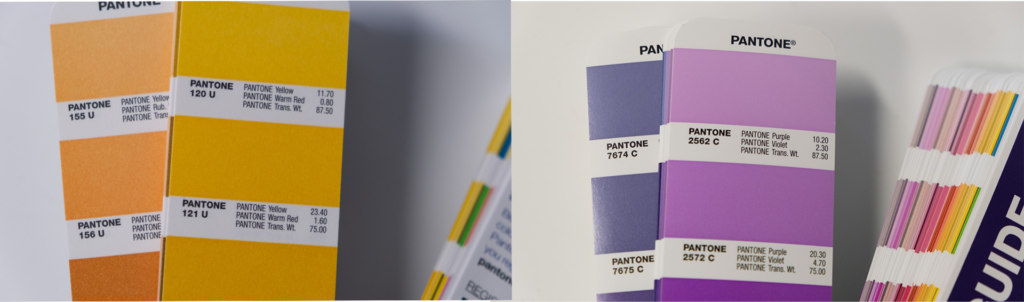
This PMS number can be found below the colour in the book. Next to this can be found the formula for creating that exact pigment using the base Pantone colours.
Large companies like Coates know the importance of branding and having all their print and signage coordinated, hence they use the Pantone matching system to convey the exact colour they need.
Where to get Pantone Books?
Pantone Books are available online on the Pantone website. Most printing companies also have Pantone books available that you can ask to use if you are having trouble conveying the specific pigment you want on your signage.
Pantone books need to be replaced annually to ensure accuracy.
- Option 1. Buy your own and keep it updated
- Option 2. Use the printer’s PMS book.
Want some more help?
If you are wanting further assistance or help on your corporate colour management please reach out on our contact page and our experienced staff will help you. You can also request an instructional video on the subject matter or guides to help you.